Introduction to Our Project
Explanatory Video
Motivations and Goals
We present two data tools to visually explore and analyze the 2016 presidential election landscape. The media tends to characterize the primary elections as horseraces for the Republican and Democrat parties, as their respective candidates jockey for the lead in delegate totals across their respective primary contests in individual states. However our visualizations dive deeper to explore public opinion through popular vote totals, poll results, internet search trends, and demographics by geography.
While casual visual inspection is by no means a rigorous analysis tool, our visualizations empower you to use an initial visual approach to finding meaning in voting patterns before a more focused and rigorous analysis with statistical tools.
We hope you enjoy our project!


Data Explore for States and Counties
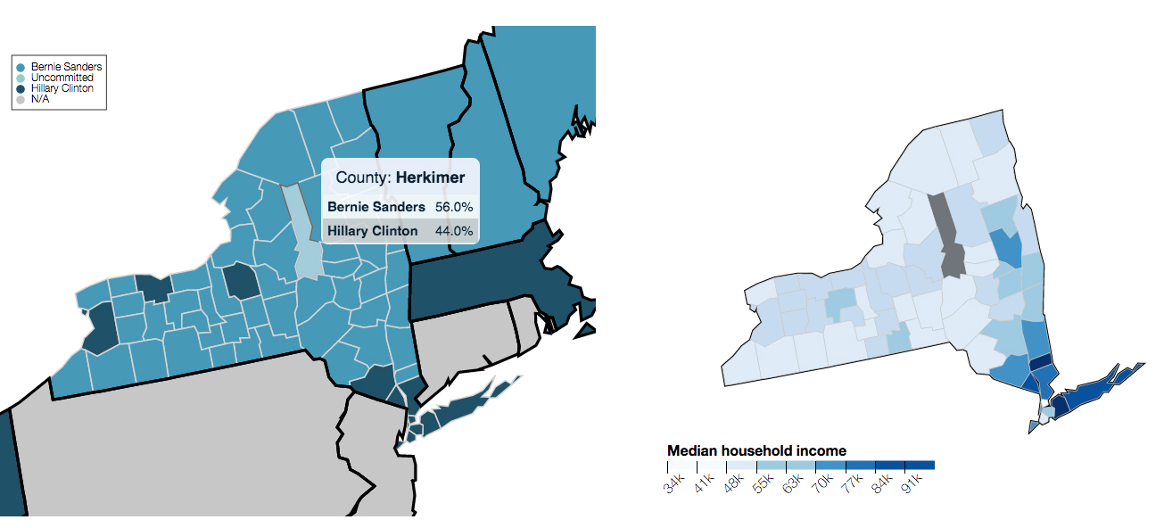
The Data Explorer for States and Counties allows the exploration of state and county level primary results. You can even visually sift and compare voting patterns to census demographic data on a county by county basis.


The Public Opinion Tracker
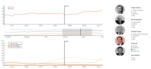
The Public Opinion Tracker allows you to explore the political environment of the 2016 election season through Polls, Trends and Events. Relate how opinion polling and the nation’s attention changes through time, and visually explore the timing between candidates’ swings in the polls and internet searches.


© Data, Inc. All rights reserved.